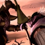
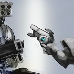
I decided to go for a Justin angle on this one, which is odd because he went for a pretty plain composition and colour scheme. It’s still fairly easy to tell who is who if you’ve been following, but the line is becoming frighteningly blurry…
- Anton
- Justin


 Logging you in...
 Loading IntenseDebate Comments...